How a PDP refresh and Brand Store redesign moved every metric that mattered.
THE MISSION
Jupiter is a dermatologist-developed dandruff brand that helps women trade up from legacy drugstore solutions without sacrificing efficacy. When they approached CRUSH ahead of their 2026 brand rollout, their Amazon presence hadn't kept pace with where the brand was going. The creative was functional, but it wasn't converting, and it wasn't Jupiter.
Our mandate was clear: refresh the hero product listing, rebuild the Brand Store, and make every design decision earn its place against a measurable outcome.
THE OUTCOME
In a few weeks, Jupiter's Amazon presence went from dated to deliberate — and shoppers noticed. A Brand Store rebuild and full PDP carousel refresh drove a 26.6% increase in total views, an 11.1% sales lift, and an 18.4% jump in dwell time. The numbers reflect what the creative was designed to do: get more people in, and keep them there longer.
TEAM
Creative Strategy & Lead Designer: Nik Kretzschmar
Production Designer: Kim Salinas
DATE
2026
Leading with strategy, not assumptions
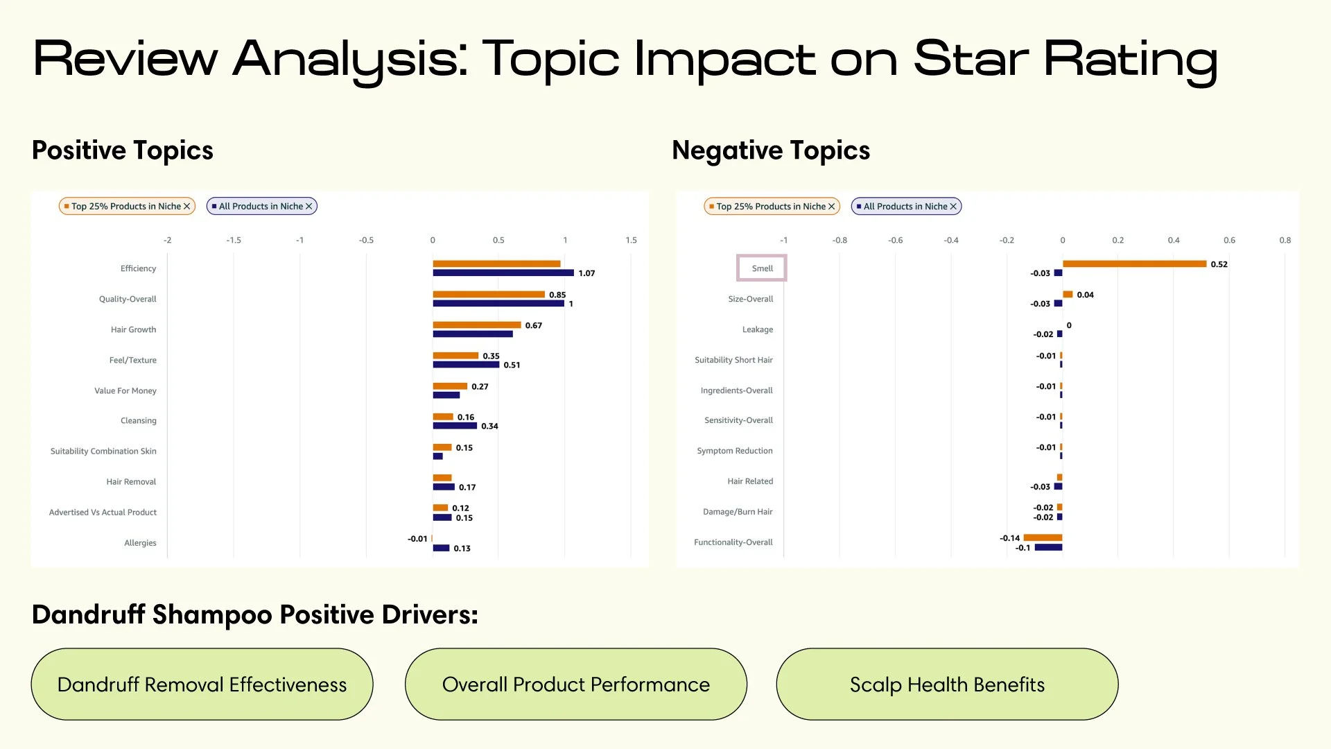
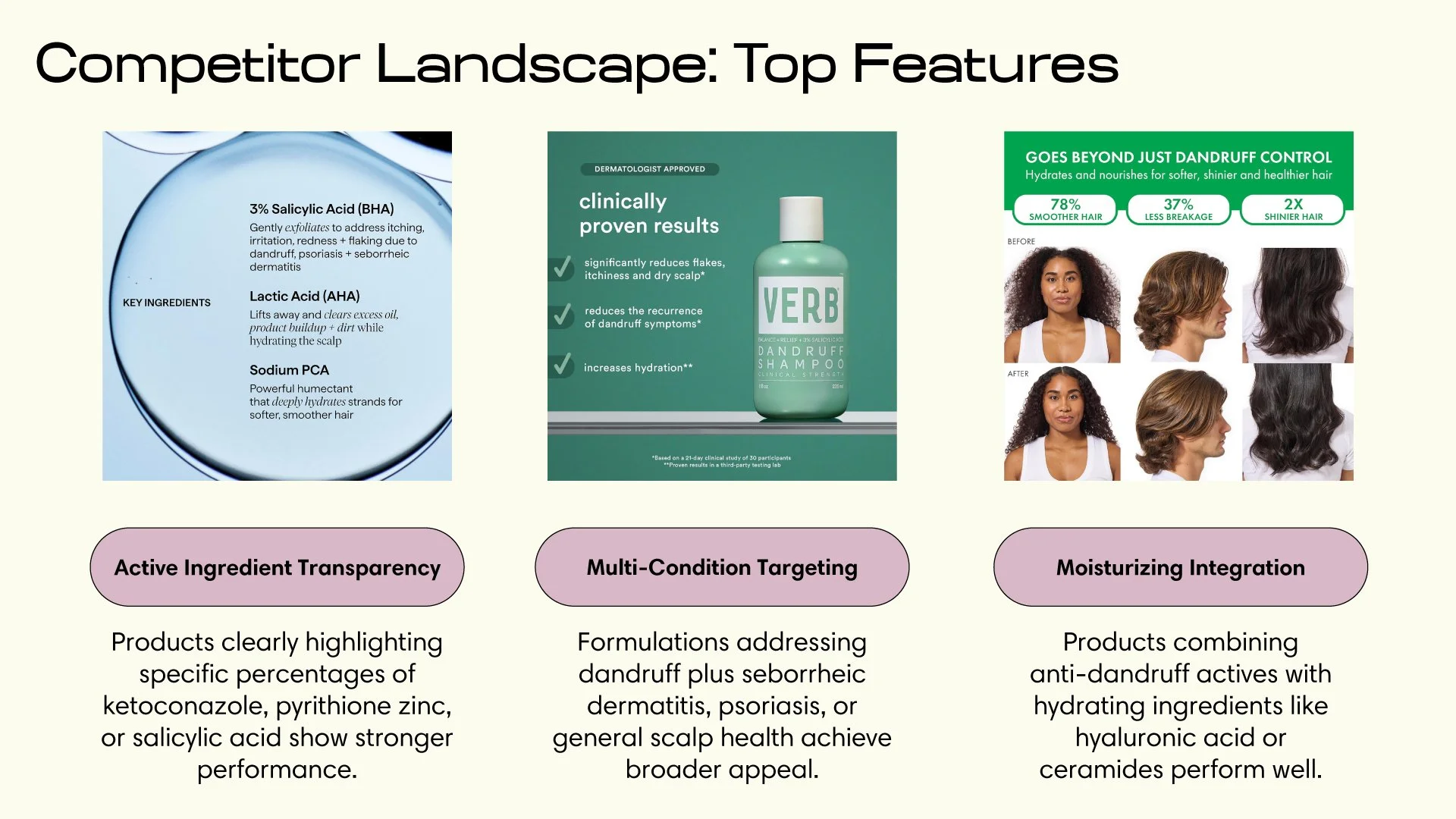
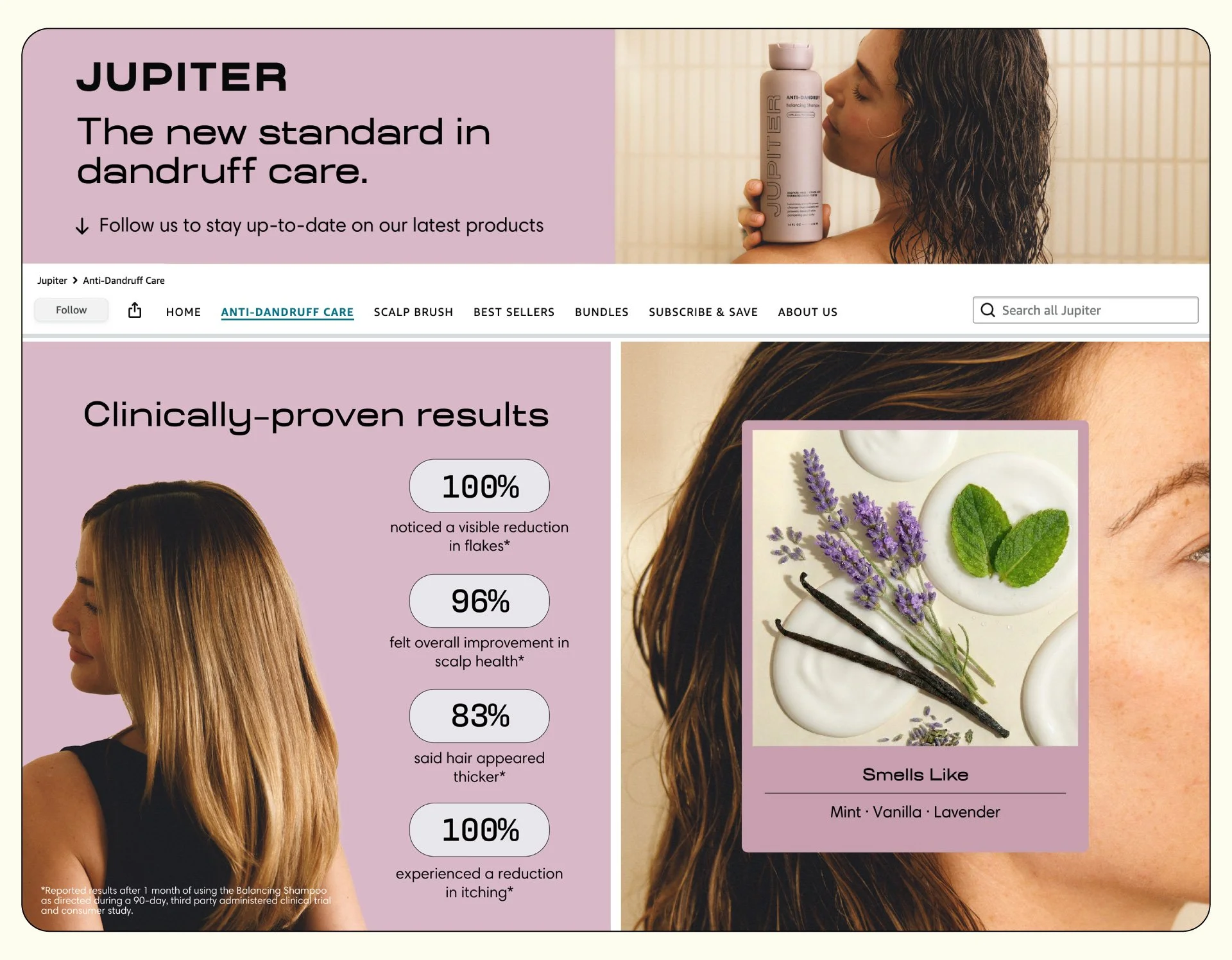
Before opening Figma, I conducted a creative audit on the anti-dandruff shampoo category on Amazon. The audit revealed that across top anti-dandruff brands on Amazon, customers’ primary purchase driver was product efficacy. Competitors were heavily focused on clinical studies, before and after imagery, and symptoms-focused messaging. Most brands were selling efficacy but not overall experience which is where Jupiter had an opportunity to capitalize on.
We paired that with a deep read of Jupiter's customer reviews — mining the language real buyers used to describe their results, their hesitations, and what finally made them convert. That language became the backbone of our messaging hierarchy: scalp confidence first, ingredient efficacy second, and product experience third.
Redesigning the product detail page
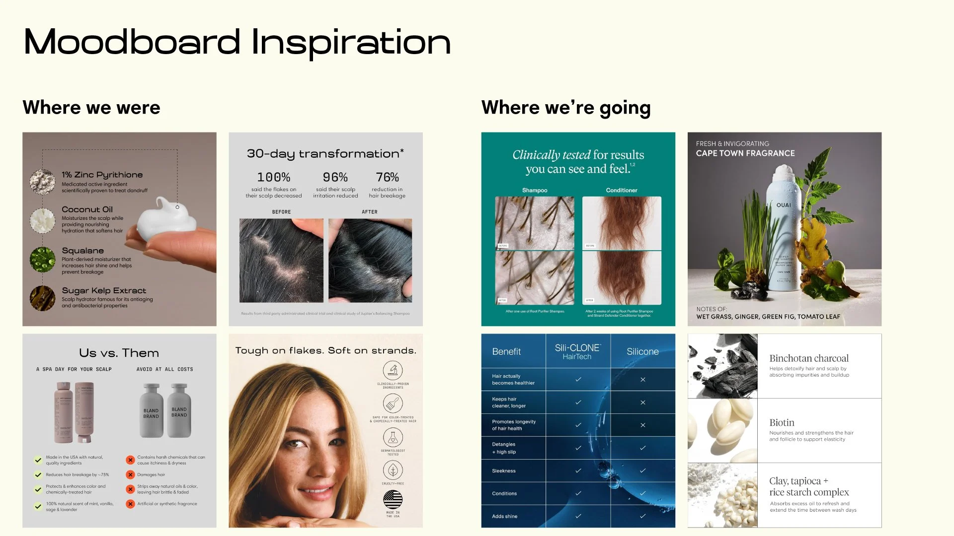
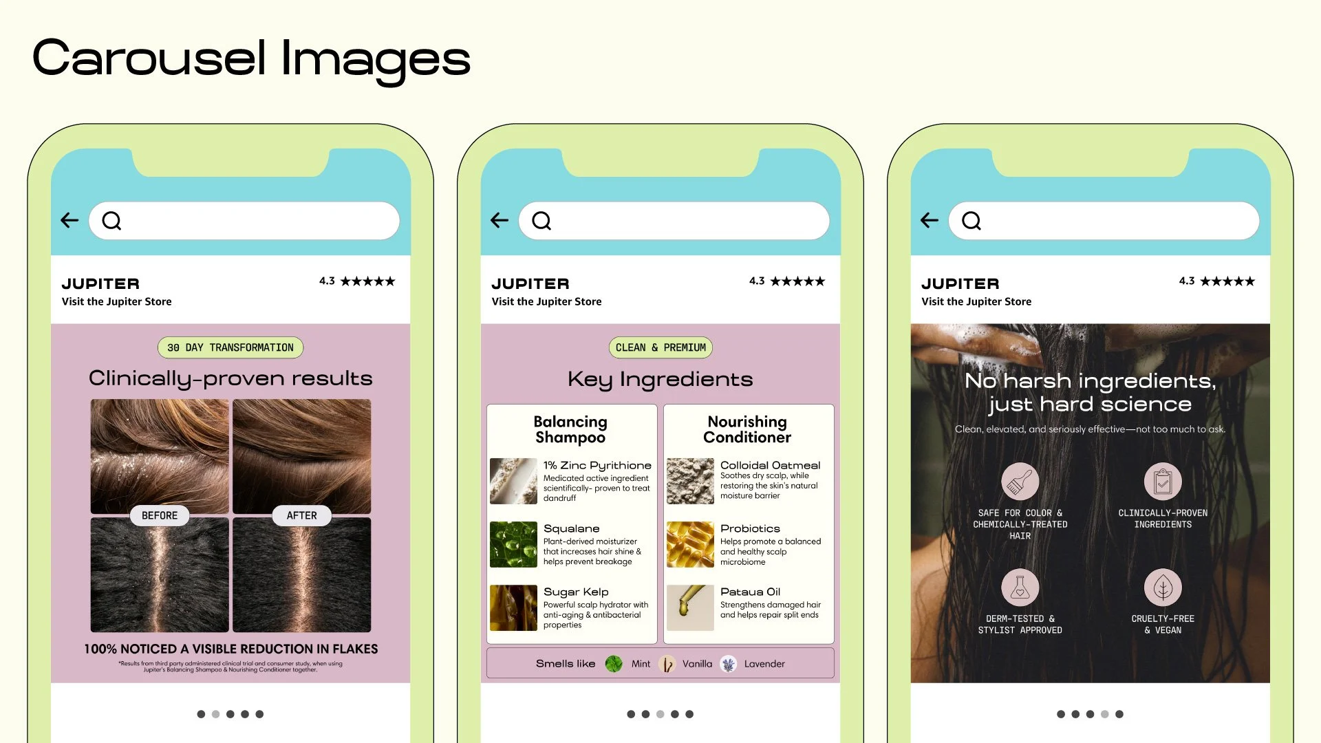
The carousel refresh centered on Jupiter's hero product — their shampoo and conditioner duo. The existing listing had a solid foundation but was missing the mark in terms of brand perception and design legibility. We sat down with their creative director to go through their 2026 brand guidelines and target demographic to understand how to better position their visual identity to their target audience.
Each image in the sequence was mapped to a specific job: establish the brand, communicate the benefit, address the key purchase objection, deliver social proof, and close with the routine. We updated every frame to reflect Jupiter's 2026 brand direction — new typography, elevated lifestyle photography, and a visual system consistent enough to hold across the full store.
The result was a listing that felt like the brand it was representing.
Building a store worth exploring
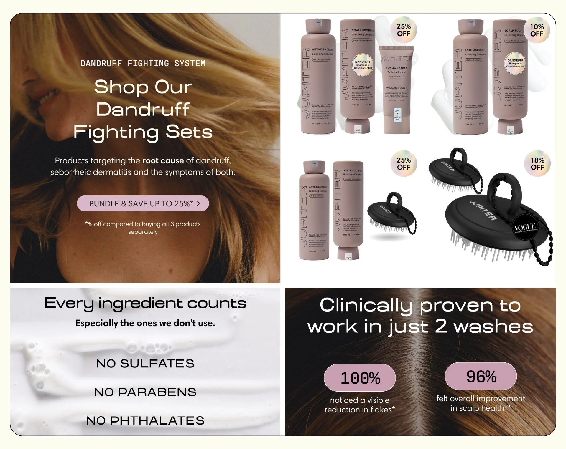
The Jupiter Brand Store had been a single-page experience. To support the goal of increasing average order value, we needed to give customers more to discover — and a reason to stay.
We rebuilt the homepage around Jupiter's hero duo, then developed additional store pages designed to extend the customer journey: a dedicated anti-dandruff page, a net new scalp brush page, and an about us page to humanize the brand and tell the founder story rather than just highlight SKUs. Every page was built with the same visual language as the refreshed PDP — so whether a shopper landed on the listing or the store, they were in the same brand world.
Pages per session increased 8.3%. Dwell time increased 18.4%. Shoppers weren't just arriving — they were moving through.
What the work delivered
Measured month over month, the results across Jupiter's Brand Store reflected meaningful engagement and sales growth across every tracked metric.
The strongest signal wasn't the sales lift — it was the behavioral data. Higher dwell time and more pages per session told us the Jupiter Brand Store redesign was working as intended: turning passive browsers into active shoppers who spent time with the brand before buying.
This project reinforced something I come back to often — on Amazon, design is a conversion tool. Every frame, every headline, every layout decision exists to move someone one step closer to a purchase. Getting that right requires equal parts strategic clarity and craft.
Month over month data
-
An 11.1% month-over-month sales increase on the store was the clearest validation of the creative strategy. Designing assets that focused on increasing average order value resulted in a positive sales lift.
-
The most direct measure of visibility across the store. A 26.6% increase in total views meant the refreshed Jupiter Brand Store wasn't just better looking — it was pulling more traffic deeper into the experience. Stronger visual hierarchy on the homepage gave shoppers more reason to click through to additional pages rather than bouncing back to search results.
-
This was the metric I watched most closely. Dwell time measures how long a shopper spends inside the Jupiter Brand Store — and an 18.4% increase told us the redesign was doing its job. When a store is visually coherent, easy to navigate, and tells a compelling brand story, people stay. That time spent with the brand before purchase is what separates a considered buy from a shopper bouncing to another competitor.
-
The additional store pages we built gave shoppers somewhere to go after the homepage. An 8.3% increase in pages per session reflected that. Shoppers were exploring the brand, not just checking out the hero product. That behavior is the foundation of AOV growth over time.